Style Guide

Type: Branding, Visual Design, & Icon and Logo Creation
Tools: Photoshop | Illustrator | InDesign | Prototyping | Field Surveys
Be the Bean is a new community-based coffeehouse with a grand opening in 6 short weeks. I was hired to provide visual design direction and branding. I started by creating user personas to determine the demographics for the market segment they will be attracting. This information helped me determine the needs of the sample customers.
Competitor observation data were compiled to best direct Be the Bean on a path to capture its intended market share and get off to a successful start. Deliverables are brand identity through a mission statement, color schemes, logos, icons, and typography in a neat package of an official style guide.
After the initial kickoff to define the project, the priority was establishing a solid mission statement. I collected images and words and asked my clients to think about how they wanted Be the Bean to be seen by their customers, community, and global partners. Brand personalities coupled with target audience data yielded robust and community-based involvement. Be the Bean definitely has a heart!
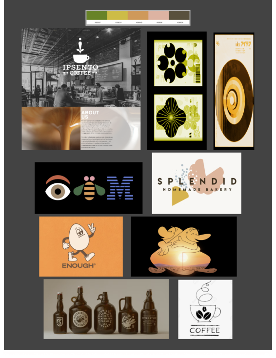
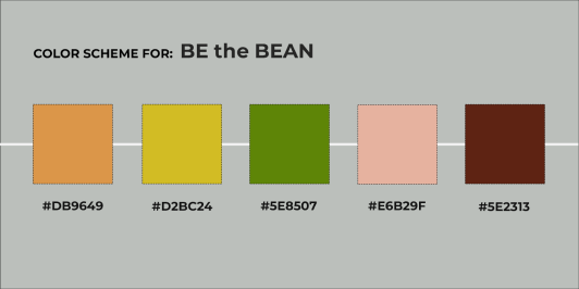
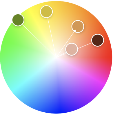
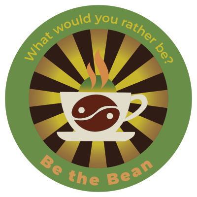
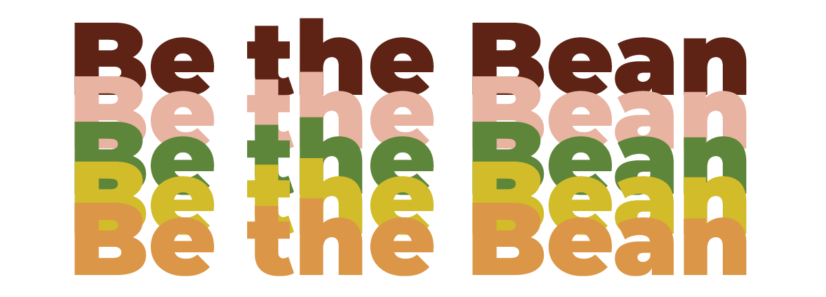
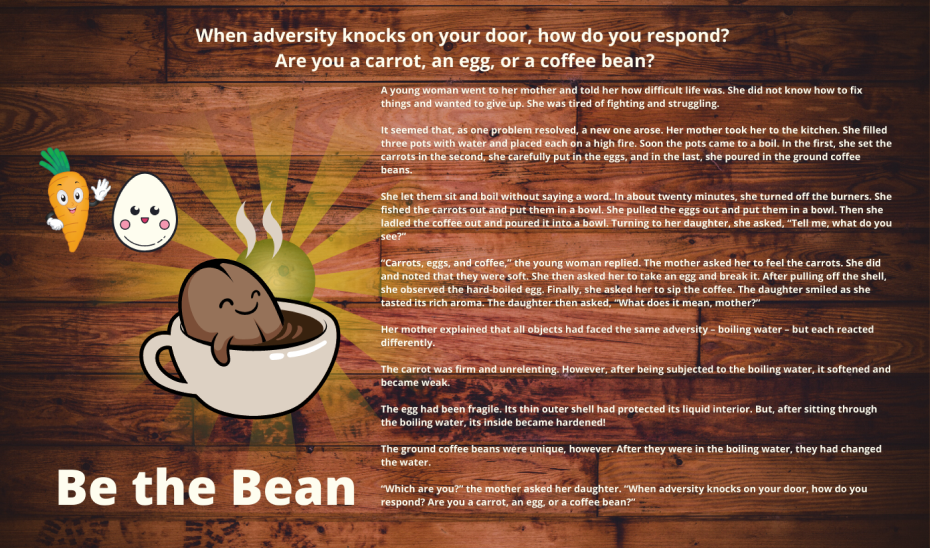
There was a bit back and forth regarding colors and themes. I found it helpful to create a mood board to try to spark conversation and build direction. I was told the fable of "The Carrot, the Egg, & the Coffee Bean ." It inspired me to look into the tones and hues to lend authenticity and brand history of giving it "roots." Warmth, zen feelings, confidence, and overall community were achieved. The final diverse palette seems to ask a friend to come in and stay awhile.
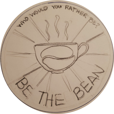
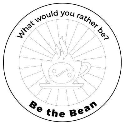
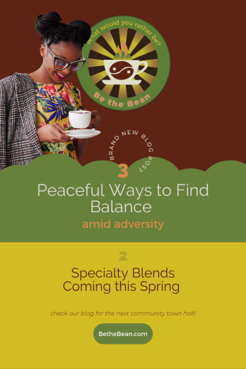
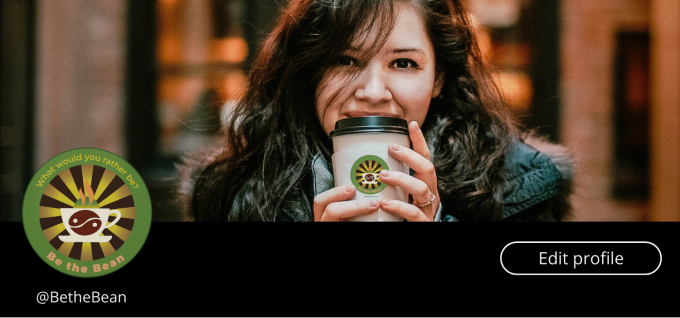
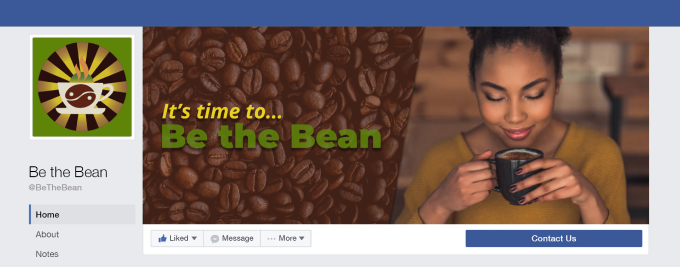
We discussed how the logo would be integrated. It needed to be versatile with versions of the primary logo to be used in email campaigns, social media headers and merchandising. From initial sketches to HiFi wireframes, I gave them two substantial variations of the logo and the five fonts options in colorways for use in aprons and caps for employees and merchandising for sale and promotion for customers.

I was asked to create a sample social media header. I offered an array of choices exhibiting the variations on the logo and placement on merchandise. And I explored a dark mode option for Twitter. They are designed to be warm and inviting and show integrity behind every cup.
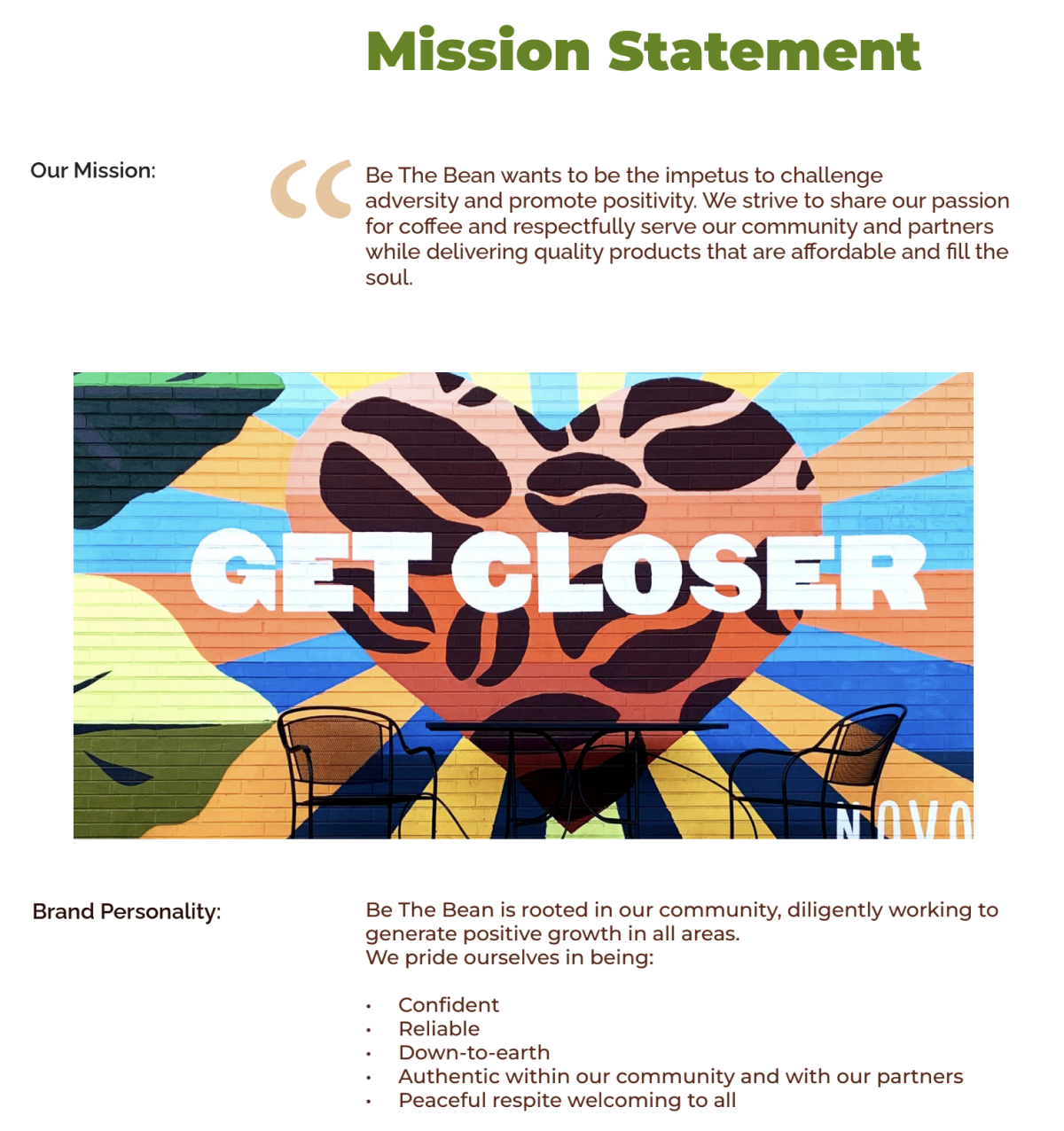
This was a fantastic project. The time constrictions made things very tight. For example, the mural contest was the closest to the wire. Announcing a winner and getting the mural finished as designed in Canva by 16 yr old Kavya Dhillon for the grand opening was a community effort. Her artistry is seen daily and embodies the spirit of Be the Bean.
The client's visual style guide was delivered
on time and on budget. The result is a complete marketing guide to keep
them consistently on brand and grounded within the community.
The link
to Be the Bean's company style guide is below.