Style Guide
Type: Branding, Visual Design, & Icon and Logo Creation
Tools: Photoshop | Illustrator | InDesign | Prototyping | Field Surveys
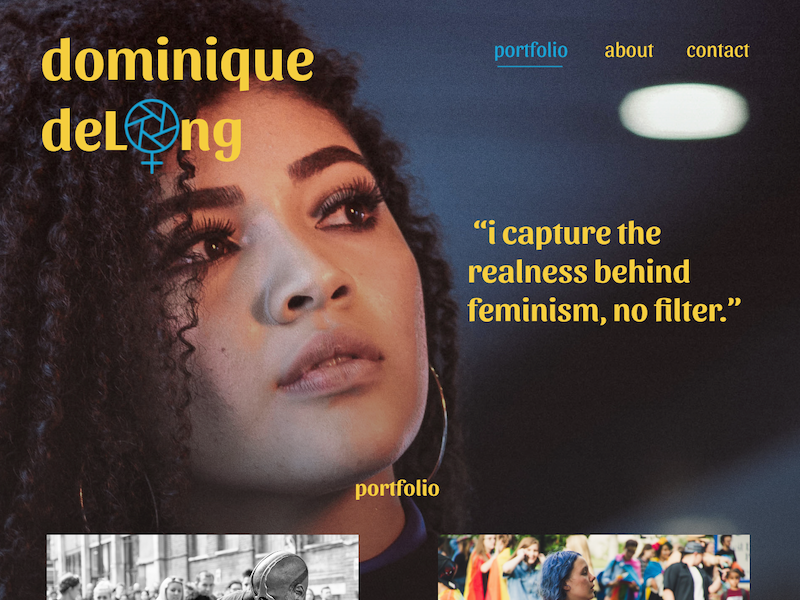
The project was to design a single-page website and offer a new brand direction for a design collective, PixelParrot. The goal of the webpage is to showcase varied projects that could eventually grow into a complete site with a blog and links to company information.
They are a small business and are overworked. They want a fresh set of eyes looking at the company, and their objectives and have no time to become their own client. Utilizing their user data, I established a target segment to help guide the changes in styles and color and the direction of the site to solidify their brand as they evolve.
I was given one item from the clients. It was an image of a gorgeous parrot. I was able to sample colors from the image and filter them down to a color scheme for the website.
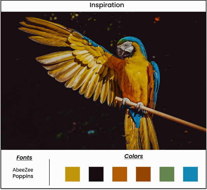
AbeeZee and Poppins fonts were chosen for clarity and legibility since one member of the collective, Andrew, has visual issues with contrast. I have learned that left-aligned text, plenty of leading space, and not using all caps are preferred for optimum visibility in his case. The color scheme represents clarity, trust, growth, and confidence. The collective wants to be respectful and inclusive in all communication.
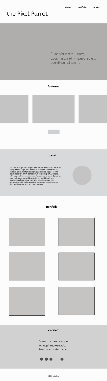
Photoshop wireframes have been the basis of our creative conversations. The parrot imagery and inspiration helped guide my decision-making and the overall placement of content. I suggested a carousel of recent projects below the hero section that can lead to case studies about the company's role concerning their role in each project.
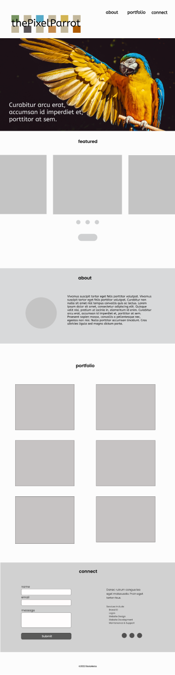
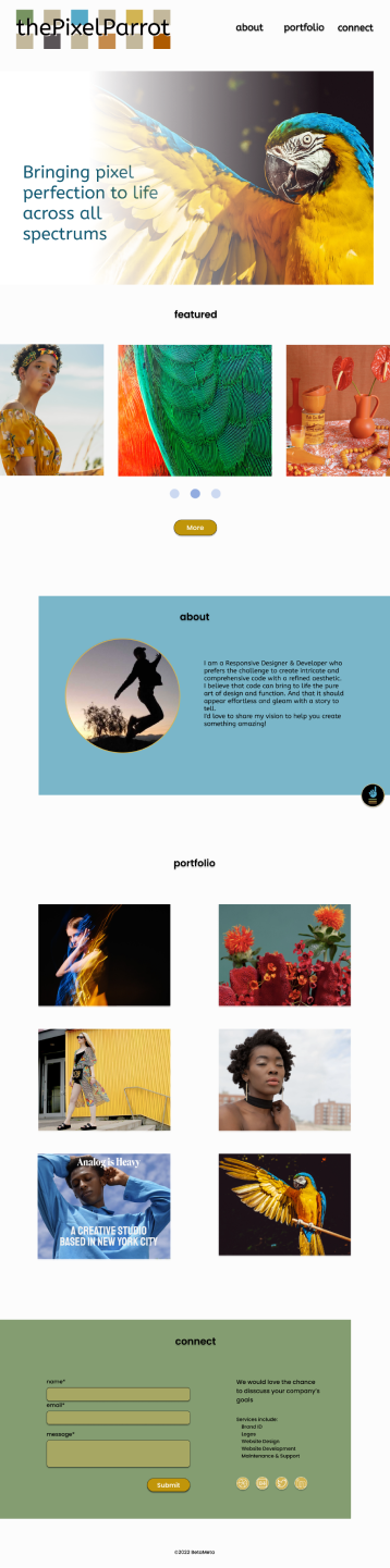
Their original logo was freshened up and altered with the addition of the word "THE" to avoid issues securing a web domain and subsequent company email. Based on their growth trending data, I will also follow up on a CMS-based case study page design for her projects to be seen when clicked.
As the content for the website began to expand, I suggested an icon that could direct viewers back to the top of the page. With several iterations offered, one was approved for the site.
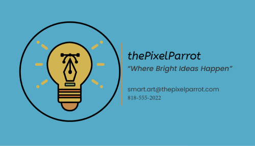
Inspired by my icons, they asked for another icon specifically related to the design for a business card. It is fun creating in Illustrator. As creatives with accessibility in mind, I made them two variations of an icon that are versatile for better visibility as needed.
Working with a group of designers is always a leap into the unknown. I was happy to lighten their load by generating a website prototype to let them see what is possible. I would love to follow up to develop the site more to add case study pages and help build their blog and corporate pages. ThePixelParrot is a fantastic collective with talent that wants to be so respectful. Thanks to Andrew, I learned how to improve my skills regarding reader visibility. I learned many new accessibility techniques I will take with me on future projects.