Visual Design
Type: Visual Design
Tools: Figma | HiFi Wireframing
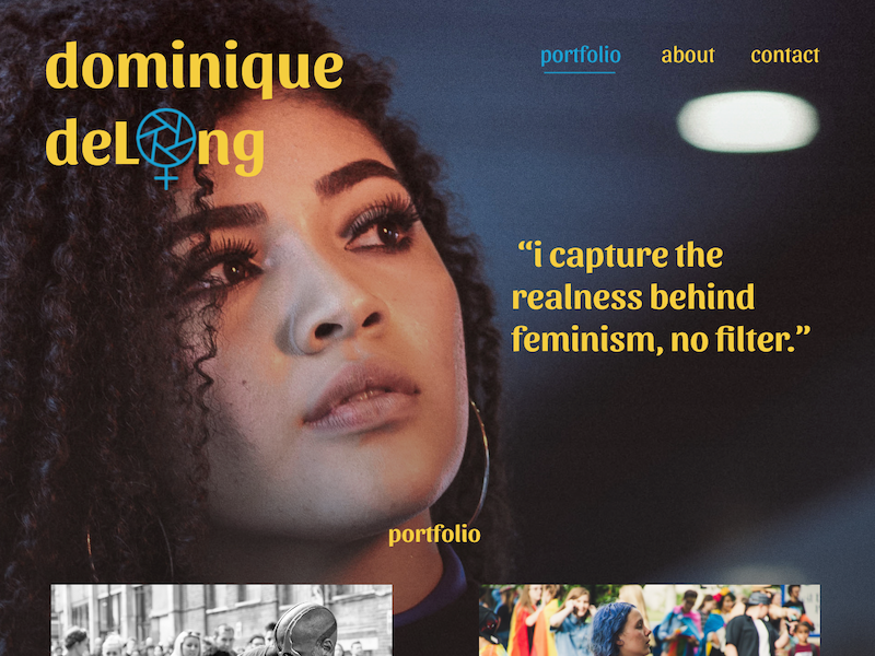
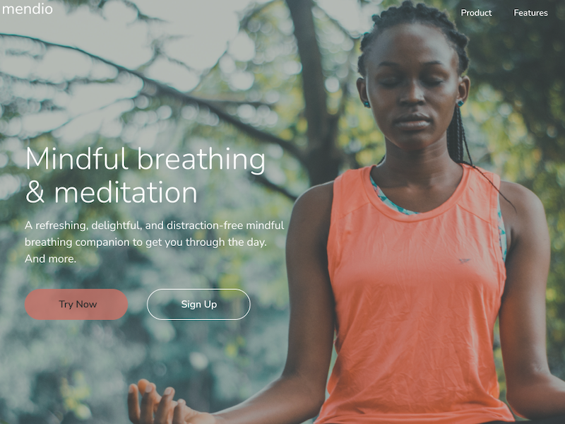
Description: Created a style sheet for a new establishment defining user personas, applying branding through color theory, logos, typography, icons, and imagery.
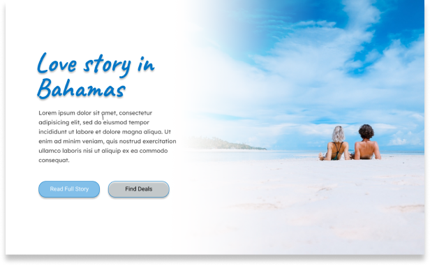
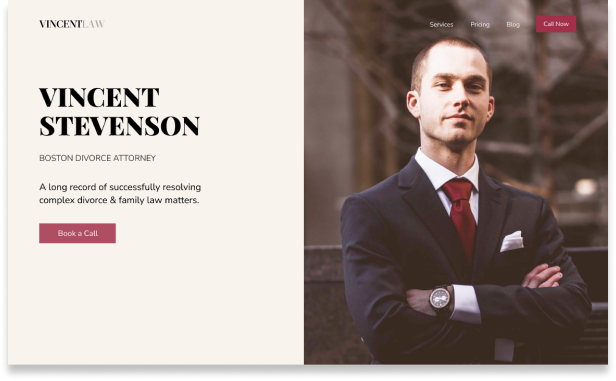
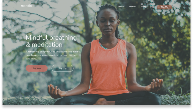
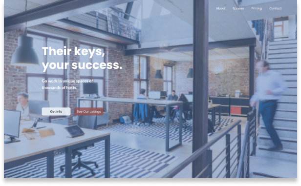
This case study is a combination of projects. Creating wireframes in this way is like "fast sketching" of ideas based on things I have seen and wanted to figure out how to do them by recreating the designs. The elements like boxes, and I envision how I can make them work together as a seamless mosaic. In exercises like these, I strive to improve the depth of my skillset and improve my speed in building creative content for all applications.
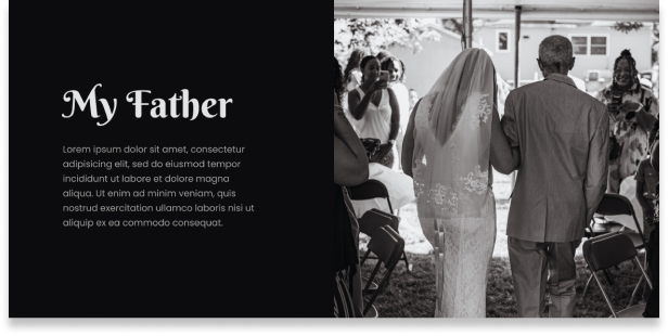
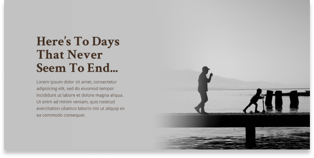
Goals achieved gaining experience with balancing elements, color theory and blending, text placement, and image anchoring and transitions.
Designing wireframes opens my mind. It shows me the possibilities on a page, a website, an email presentation, or supporting print projects. I like to explore tension, split frames, blend colors, and create negative space to improve focus on content.


I believe that one should constantly be learning and experiencing. Exercises are helpful when between projects to keep me sharp and my eyes on the lookout for new methods to add to my skillset. I enjoy adding to a curated collection folder when inspiration presents itself.